

Hello everyone! ♥
Being a bookworm / book blogger is one of the most wonderful thing in the world. We got to collect books and stare at them and read them over and over again. Buuuut, collecting book isn’t all sunshine and rainbow! I mean, aside of making us broke, there are A LOT of things we dislike from collecting books! Shocker, I know 😛 it’s been a while since I make a list and rant and today I’m feeling a bit ranty, so here goes 10 bookish pet peeves that really annoy me! I’m sure you’ll find one or two or all ten things that equally bother you from this list 😛
(1) Mismatched Series
Mismatched series is one of the most horrifying thing to ever happens to a bookworm. But I admit, this one is my fault because I basically did it to myself. I love the US covers so much, they’re a lot prettier and seems more classy (?) while UK covers seem a lot more terrifying.
The thing is, US edition is wayyy more expensive than the UK counterpart. I knew it already, yet I still purchased the US edition of A Darker Shade of Magic. The US edition of A Gathering of Shadows was expensive but I planned to buy it a little closer to A Conjuring of Light release date, so I figured I’d have the time to save the money. BUT curiosity got the better of me and I just couldn’t wait anymore. So I purchased the UK edition. It was half the price of the US one, but I still regret it. I swear I’d eventually buy the US edition of all three books 😛
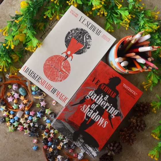
(2) Bookstores Selling Mismatched Series

While I admit that number 1 is my fault, this one is absolutely not on me. It’s the bookstores’ fault. Really, sometimes they sell series on different editions (or at least different heights) and it really breaks my heart </3 look at the books on the picture above!
I swear I bought each series from the same bookstore. I bought the entire Delirium series from Periplus and Daughter of Smoke and Bone from Gramedia, yet this thing happened. We went along fine until the second book but then book 3 came out and they have grown a lot taller?? Are they having growth spurt?!
(3) Bookstores Selling Paperbacks/Hardbacks ONLY
I’d love to say I prefer hardback, but I honestly don’t. Hardbacks are heavier, the corners are too pointy, and the dust jackets tend to get wrinkled, but most importantly hardbacks are a lot less affordable than regular paperbacks :’) But, I do want my series to be all hardbacks or all paperbacks. Bookstores know this, so obviously they don’t let it happen. Nope. They sell book 1 in hardback and the rest in paperback. I mean, what am I supposed to do? I had no choice, I bought the available edition.
This also happened with Gemina last month. I bought Illuminae in hardback because that’s the one available (but it was also pretty so no regrets) so obviously I want my Gemina in hardback as well but surprise, they sell it in paperback </3 I refused to fall into the trap and ordered the hardback online.
(4) Stickers on Covers

Can’t we just all agree that unremovable stickers on covers are one of the meanest thing publishers could ever do??! I mean, where’s the aesthetic in it? Look at the cover of End of Days above. Do we really need that ‘The Explosive Conclusion to Angelfall Trilogy’ sticker on its cover?
We do not.
Because 1) It’s ugly. 2) The colors don’t even match. 3) They could’ve put it somewhere else, like the spine or under the title, probably? and 4) Who even likes this?? As far as I know everybody hates stickers on covers.
(5) Price Stickers That Leave Residue

Another evil, mean thing bookstores could do to us. Kinokuniya, specifically, because I haven’t encountered other bookstores that do the same thing. Kinokuniya clearly had to put price sticker on the books, unlike other sensible bookstores that put it on the plastic wrapping. And clearly the stickers had to leave residue if we dare try to remove them. Believe me, I tried, I used water and baby oil and everything and none of it worked.
Look at my copy of Requiem above. The residue is so hideous and I don’t even bother trying anymore >.<
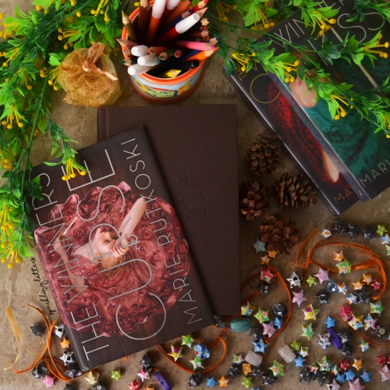
(6) Different Heights

Wouldn’t it be awesome if ALL books are of the same heights? Because different height is annoying. It makes it harder to stack the books on my shelves. I can’t even put books on top of books because… well, different heights? The only thing worse than different height is different height within the same series </3
My preferred height would be the second from the right (see Angelfall and Rebel of the Sands). I think it’s ideal, not too big nor too small and they fit everywhere. Plus, it’s the perfect size for me to comfortably hold the book.
(7) Books Too Short and Too Thick to Comfortably Hold Open

Sarah J. Maas had to know that all her books are SO THICK, so.. you know, might be better if the size is a little bigger? I just feel uncomfortable holding thick and short books for too long, it’s exhausting and I keep accidentally closing them. Plus, sometimes the spine cracks and that’s just no fun 😦
(8) Handwritten Fonts
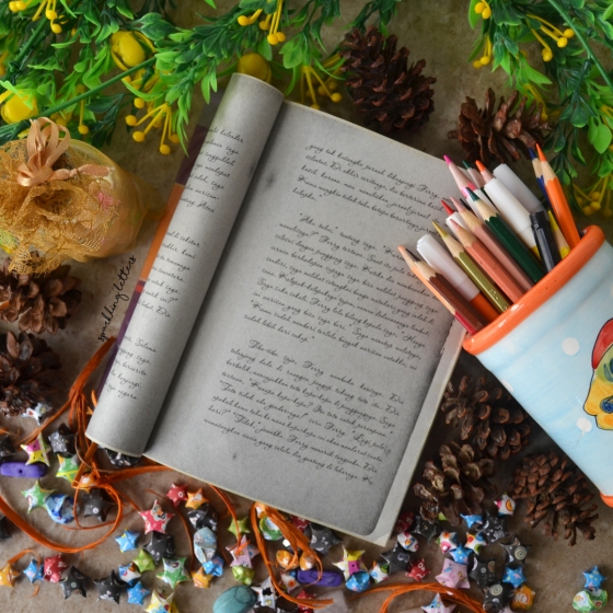
Don’t get me wrong, I LOVE handwritten fonts. They look fancy and absolutely gorgeous ♥ I mean, have you seen my header and pretty much all my featured images? Script fonts are my life, except when they appear on books </3 I don’t mind one or two sentences on script fonts, but a whole page? It’s very common on books involving letters. All these swirls are exhausting to read and frankly, I don’t understand why.
I mean, every time I write (letters or not) I write in block letters. In fact, I don’t know anyone in real life who actually writes like this unless they’re doing a bullet journal or something 😛 But if it’s really necessary… I guess they could choose an easier-to-read font? Preferably something less swirly.
(9) Yellowing Pages

As you could see from the date on the book, I purchased this just a little over 3 years ago. BUT, the pages are already turning yellow. And sadly this thing happens a lot to my books (but not all, like I have books from 6 years ago that are still in good condition so it’s kind of weird?). I’m sad because I like my books on their pristine condition and I do take care of them. I clean them daily, take them out of the shelves and put them back at least once in 3 months, yet it still happens. SEND HELP!
My guess is because my bookshelves don’t get enough sunlight? But I read somewhere that we’re not supposed to place book under direct sunlight. Anyone knows how to prevent/fix this? Suggestions are more than welcome! ♥♥♥
(10) Dark Text on Dark Paper
WARNING. Don’t read the texts on the picture below if you don’t wanna know anything about Gemina.

I’m sorry Gemina, I love you but this is just annoying. I mean really, gray texts on black paper? Not enough contrast. This photo is lying though 😛 it looks significantly better and more contrast because I took the picture under direct sunlight, but it looks super dark when I read it in my room, using a regular lamp.

Those are 10 annoying bookish pet peeves that seriously bother me! Do you feel them too? Do these things bother you as much as they do to me? What are your pet peeves? LET’S RANT TOGETHER! 😛 alsooo, does anyone have proven tips on how to prevent book pages from yellowing? I seriously need some ♦♦
Find more of me on my social media ♦
Instagram • Twitter • Facebook • Goodreads • Pinterest • Linkedin


Your book photos are STUNNING. Gosh, I can’t stop staring at them.
But, yes, I agree with a lot of these. The one I hate most is having stickers on books. Grrrr. Especially when the stickers start to come off and they bend / look wrinkled. This problem is worse when I buy used books with stickers, but it’s so unsightly! Oh, and when you removed the stickers? The residue you mentioned is even worse!
My dislike of stickers on books is so bad I sometimes won’t buy a book because it has a sticker on it. lol!
LikeLiked by 1 person
YAAAYYYY THANK YOU! ❤ I'm flattered 😀 I know rightttt stickers are the worst and I don't get why publishers keep doing it while we all hate it :') hahaha that's kind of extreme 😛 buuuut sometimes it happens to me with books I order online. I have no idea that they will have stickers on covers! And ohhh some people said to use nail polish remover/alcohol to remove the residue, maybe you should try it too 😀
LikeLike
Yesss to so many of these. Stickers are the WORST. Why do publishers keep doing that? Also, it’s so frustrating when a cover is changed or the sizes are all different.
LikeLiked by 1 person
I know right!! OH and even worse is when the new cover is uglier than the first one, I just don’t get it :’)
LikeLike
I agree with pretty much all of this. Especially mismatched series and stickers and sticky price stickers! I also dislike hardcovers, so I avoid them as much as possible. Books that are too hard to hold are also the worst – how are we meant to read them if we can’t hold them?!
LikeLiked by 1 person
Yayyy! *high five* Ugh I know right stickers are the worst, I wish publishers would stop doing this. Yeeeeesss it’s tiring to hold them for too long 😦
LikeLike
Agh I hate the stickers too. Non-removable ones spoil the cover and removeable ones are even worse! I also secretly hate hardcovers – so awkward to hold.
LikeLiked by 1 person
Exactly!! It makes the cover seems ugly and the sticker is always out of place. Ahh I thought everybody prefers hard covers 😛
LikeLiked by 1 person
I love your photos! They’re so pretty.
Stickers on books are disgusting. And price stickers are even worse >.< Especially because sometimes only parts of it come off. I hate when paperback books are so massive that the spines crack! It's so dissatisfying to see a crack down the side 😦
LikeLiked by 1 person
Thank you so much! 😀 Ohh I received some tips to remove the stickers on the comments. They said we could use alcohol.nail polish remover to clean the residue so maybe you want to give it a try 😀 yeeesss a crack on the spine is not fun </3
LikeLiked by 1 person
Okay then, I will try both 😀
LikeLiked by 1 person
Hope they work! 😀
LikeLiked by 1 person
Ok yes, there should just be one book size that all books must be made with. Then they wouldn’t be all different heights and sticking out differently on our shelves.
But ahhh the UK covers for the VE Schwab series are some of my favorite covers ever! I haven’t even read the series and I’m obsessed with those covers. Except I live in the US lol.
LikeLiked by 1 person
Right!! Right?!! Hahaha I like my shelves fully organized so yes petition for different sized books 😛 aaahhh I’m willing to trade all my Scwhab’s books for the US ones! Except for Vicious because I love the UK cover better 😛 Aside from ADSOM, all my Schwab’s books are in UK edition hahaha
LikeLike
I use rubbing alcohol or nail polish remover to get the stickers off my books. You just have to be careful to not soak it so it doesn’t get messed up. After that you should be able to rub off the residue.
LikeLiked by 1 person
Ooohhh I’m definitely gonna give this a try! Thank you so much for the tips 😀
LikeLiked by 1 person
Great post!! Eucalyptus oil is great for getting rid of that sticky residue – you just need a little on a cotton ball.
LikeLiked by 1 person
Thank you! 😀 Hmm I don’t think I have one of those haha but if I find it I’ll definitely gonna give it a try. Thank you for the tips! ❤
LikeLiked by 1 person
Good luck! I’m Australian – I think everyone here has a bottle of eucalyptus oil stashed somewhere in their house. 😊
LikeLiked by 1 person
I think they use it on shampoo or something in here hahaha :’)
LikeLiked by 1 person
Post yang menarik 😀
LikeLiked by 1 person
Terimakasih Hana ❤
LikeLiked by 1 person
I HATE the height problems, omg they hurt my eyes. What doesn’t hurt them though are your pictures !! Absolutely gorgeous 😍
What I don’t have a problem with though is the script font
I actually don’t like when what’s supposed to be a hand written letter isn’t written in Script, but not more than page or it starts getting uncomfortable.
LikeLiked by 1 person
Awww thank you Fadwa!! ❤ but yeeesss the height problem is annoying 😦 Ohh you don't? Hmm I wouldn't mind so much if the fonts are bigger and easier to read though hahaha sadly some of the books use fonts that are too swirly and too fancy to read easily 😛
LikeLiked by 1 person
I LOVE this post! I don’t shop for physical books that often but I’m VERY particular about what I get. That being said, though, I never really needed my books to match until this most recent year – when I was in high school I basically would pick up sequels as soon as they’re available (this was back during the Twilight craze) and not care about how they look on the shelves. Now, though… 😉
I’m not a fan of books with different heights if they’re all in one series, but I’m totally OK with different series having different heights, though! I think it makes my bookshelves look a bit more… dynamic? It’s just a better look (imho). 😛
LikeLiked by 1 person
Thank you! 😀 Me too, I used to just buy the available edition because living in Indonesia, I don’t have much choice anyway 😛 yeeeesss I think it’s weird for books on the same series to have different size/editions! Hahaha I see what you mean, it indeed looks dynamic though haha the only drawback is that I can’t stack books on top of them :’)
LikeLike
LOL @ #10. I had the HARDEST time reading those pages. The gray they had on mine (maybe it was like it on everyone’s??) was too dark and I had to hold the book at a very specific angle to read it, and even then I had to read it sooo slowly! Love this post (:
LikeLiked by 1 person
I know right me too!! I had to read it very slowly and it hurt my eyes! :’) I mean, why don’t they use white background like usual? Haha thank you so much ❤
LikeLike
KINOKUNIYA UGH. A lot of other bookstores, especially the ones abroad, stick stickers on the covers. But they can be removed easily. Kinokuniya’s is just NO. I even ripped my Emma cover because I tried too hard removing the sticker. Ever since that incident, I don’t even bother removing the stickers 😒 Mismatched series, in covers or heights, are also one of my pet peeves. Like why does the same cover has to have different heights???
LikeLiked by 1 person
I KNOW RIGHT!! I don’t know why Kinokuniya does this, maybe to make sure we never forget where we purchased the books and how much they cost?hahaha but that’s silly! </3 Me too, I just leave them be… exactly!! That's what I thought! I mean, most of the times the number of pages are not that different, so why does the size have to be bigger/smaller? 😦
LikeLike
At least they could try to change their adhesive or something so it won’t be THAT sticky.. It’s the only thing I hate about Kino!
LikeLike
Number one and two are huge on my list! This is exactly why my shelves look awful haha. I have to be honest though, I have never encountered a store that only offered hardback/paperback unless it was a title that was not yet released in one format or the other.
The stickers generally remove very easily for me. So fat (knock on wood) it has not been an issue. Great post!
LikeLiked by 1 person
I knooooowww it’s poor aesthetics! Hahaha ohh it’s probably because I live in Indonesia where we have to import books from the US. I think imported goods are limited so we don’t have much choice when it comes to different editions 🙂 Thank you! ❤
LikeLiked by 1 person
I HATE WHEN BOOKSTORES ONLY SELL PAPERBACK OR HARDBACK. I’ve been trying foreverrrr to find books in hardback cover (because I prefer hardcover), but all the bookstores sell paperback only. It drives me nuts! I also hate different height books. My Heartless book by Marissa Meyer is so much bigger than her other series. It breaks me soul seeing how out of place it looks on my bookshelf. ):
LikeLiked by 1 person
I know right!! They really don’t give us much choice :’) Ahh really? I haven’t bought Heartless but I’m looking forward to it, the cover is sooo pretty ❤
LikeLike
BOY CAN I RELATE. I feel like this must seem so silly to non-bookish folks but ARGH WHY WITH THE STICKERS?? also when you find library books with gross yellowly sticky things on the pages and you don’t know where it came from and JUST EW.
buuuuut you know what’s not ew? YOUR DELIGHTFUL PHOTOS YES PLEASE 😍😍
LikeLiked by 1 person
YEESSSS!! Pffft non-bookish folks don’t understand a lot of things! 😛 I know right, I keep saying this but EVERYBODY hates stickers so I don’t get why publishers keep doing this?! Ahh I never borrow YA from libraries here because they pretty much don’t exist </3 YAYYY THANK YOU SO MUCH! ❤
LikeLiked by 1 person
I usually like US edition covers but not always- and occasionally I see the UK or other version and I’m like, WANT. And if I can’t get it that’s irritating lol. And mismatched sizes is SO aggravating- I CANNOT have different sizes in the same series on my bookshelf, I mean obviously I do but I hate it. I need them all to match up nicely. 🙂
Stickers (especially price stickers) are another big one. How DARE they deface a book with a sticker? lol And… I hate it when the spine cracks, especially if it’s a long book and I’m trying so hard not to crack it and it happens anyway. 🙂
LikeLiked by 1 person
OHHH I’m curious, if you live in US, do they sell the UK version there and vice versa? Because I live in Indonesia and they sell both versions 🙂 I know riiightttt I hate it too but sometimes I have no choice! </3 Stickers should be banned immediately though hahaha
LikeLike
Well not usually, I don’t see the UK covers here very much. I wish I did, as sometimes I prefer them? Just depends on the book !
LikeLiked by 1 person
Ahh I see, must suck to not have options 😛
LikeLike
The stickers bother me so much especially because its hard to remove them without ruining a book. The last one is an issue for me too because of the strain on the eyes. Great post!
LikeLiked by 1 person
I know rightttt! I hate it when I have to like squint my eyes and try so hard to read the books, too much effort :’)
LikeLike
I don’t know where you’re living, but I think the yellowing might have something to do with humidity.
LikeLiked by 1 person
I live in Indonesia which is pretty humid (I think). We’re tropical islands! 🙂
LikeLike
Wasn’t sure if you were still in Indonesia or not! But yeah, some of my books that did fine in a cooler climate for years turned yellow so fast when I brought them to Indonesia, so it’s something to do with the climate, I think.
LikeLiked by 1 person
I still am! And don’t plan on leaving anytime soon hahaha OOHHH that’s too bad! Does it mean there’s nothing I could do to prevent it? 😦 I can’t change the climate after all 😛
LikeLike
This is such a great list! I’m so glad I’m not the only one who’s put off by hardbacks – I prefer paperbacks! But yes, conflicting editions are so frustrating, especially if they’re different sizes! It makes it so hard to organise your bookshelf!
And as someone who doesn’t like to crack the spine open too far (for fear of breaking the book), really thick books get on my nerves 😦
LikeLiked by 1 person
Thank you! ❤ I knooooww I thought everyone prefers hardbacks?hahaha exactly! YEESSSS this happens quite a lot to me and it was so unfortunate 😦
LikeLiked by 1 person
Great list! I especially agree with what you said about stickers. I can’t stand it when I get a book and the stickers either leave a residue or only come half off before ripping. I have a few books where I attempted to take the stickers off but they tore a little so I just left them 😅. Also, funny enough it’s reversed for me – sometimes I end up preferring the UK covers. 🙈
LikeLiked by 1 person
Thank you Melissa! 😀 Ohhh it’s definitely the worst, but unremovable stickers are also annoying! :’) ahh really? Do they sell books with UK covers where you live?
LikeLiked by 1 person
You’re welcome! 💕
True. Unremovable stickers are the worst. They don’t but I use Book Depository when I want a UK cover. They’re usually cheaper book price wise and free shipping. 😊
LikeLiked by 1 person
Pingback: 6 Reasons WHY You Should Write Discussion Posts + Tips & Tricks to Nail Them | Sparkling Letters
Ahhh I absolutely hate all of these too. The different heights and hardcover/paperback are the worst!
Nereyda│ Nick & Nereyda’s Infinite Booklist
LikeLiked by 1 person
I know right!! I wish they all come out in the same height :’)
LikeLike
Okay, first YESSSS to the Gemina situation. I had to squint at that book NON-STOP and I was not amused. And the height thing… UGH. I try to make my bookshelves look cute, but HOW?! Like you said, you can never stack, because they’d be all crooked. WHY!? Why do the powers that be insist on the different heights?! It is not okay! And I have noticed this within series, too! What even!? I have some series where each book is a different height and I am so confused.
I did the same thing that you did with ADSOM and AGOS, only opposite. Now, I need the US ADSOM, because I traded away the UK one because… I wanted them to match, and I liked the US AGOS cover better hahah. And the stickers? The stickers are just RUDE. Like, no matter what I try, I cannot get rid of some of them. Even with nail polish remover, they are still a liiiitle bit sticky, and I did not approve of that! I feel you on ALL of these, ughhhh! Great post!
LikeLiked by 1 person
I KNOW RIGHT!! I was so mad at Gemina </3 exactly, it's a problem now that my books have exceeded my bookshelves capacity 😦 ugh different height within series is the worst, like, why can't they just print them on the same size?? OHHHH I wish we could trade, I would happily accept any of the US/UK as long as they match hahaha 😛 yayyy thank you ❤
LikeLike
Pingback: Sparkling Letters Monthly Recap: November 2016 | Sparkling Letters
Ugh #3 annoys me. I went into a bookstore to buy a hardcover of ACOMAF and while I was there I wanted to also buy a hardcover of ACOTAR (I had a softcover ARC, but wanted a hardcover to match). They ONLY had hardcovers of ACOMAF (fine for my needs) and ONLY had paperbacks of ACOTAR. GRRR.
LikeLiked by 1 person
I feel youuuu sister! It’s so frustrating when they do this and sadly it happens a lot to me </3 but ooohhh I 'd love a hardback ACOTAR/ACOMAF too! Mine is in paperback and I feel like it's too thick 😦
LikeLike
Pingback: The Little Engine Tag | Sparkling Letters
Pingback: Sci Fi Month Wrap Up » Simply Adrift